
A good chunk of the way into Symantec PKI Manager being implemented we realized that the existing UI template was not adequate to support the increasing number of additions to the tool required by the business. The original design called for a fixed-width template with three columns. Any search activities happened in the left panel while global action links appeared in the right panel. This left just the center panel to display all of the information for the selected user or certificate. This forced much of the functionality into modal windows. User experience wise, this wasn't ideal because the information users needed to complete tasks in the modal ended up being obscured by it. In terms of development, having complicated functionality in a modal was also a challenge.
My first thought was that the template should not have a static width, but be flexible enough to adapt to any screen size and be usable. This would also allow for the addition of a fourth panel which would be used display search results, allowing for more to be displayed by default and to reduce scrolling. I also removed the far right panel that used to be home to all of the action links and moved them to the top of the template where the horizontal width provided more than enough room. This allowed the former center panel to expand to the edge of the template, growing wider as the screen grew wider (the other three panels remained fixed width). This increased area allowed for more functionality to happen directly in the fourth panel versus having to be crammed into numerous modal windows.
The final challenge was to figure out how this new template would work for users with smaller screens. Since the first three panels were fixed width, that meant the fourth panel would take the brunt of decreased screen width. It became clear that at the standard 1366px width, there wasn't enough real estate left in the fourth panel to provide a good user experience. After numerous sketches and prototypes, I landed on a behavior where the panels would be decoupled from the UI "frame". When the fourth panel reached a predetermined width, all of the panels would shift to the left, with the first panel sliding behind the left side of the frame. A small part was still visible and coupled with a handle icon, the user could click to slide the panels back if they needed to view something in the first panel. Since the workflows always happened left to right - i.e. start with a search, view results, select item, view item details - it wasn't a problem to obscure that first panel.

Manage User UI in Old Template
Example of the Manage Users UI in the static, three panel, template. Having the search results in the same panel as the search UI limited the number of results that could be displayed by default. Having the global action links in the far right panel limited the width of the center panel and was mixing contexts.

Revised Template Sketches
Sketchwork done when trying to figure out the behavior for how the panels would work in different screen widths.
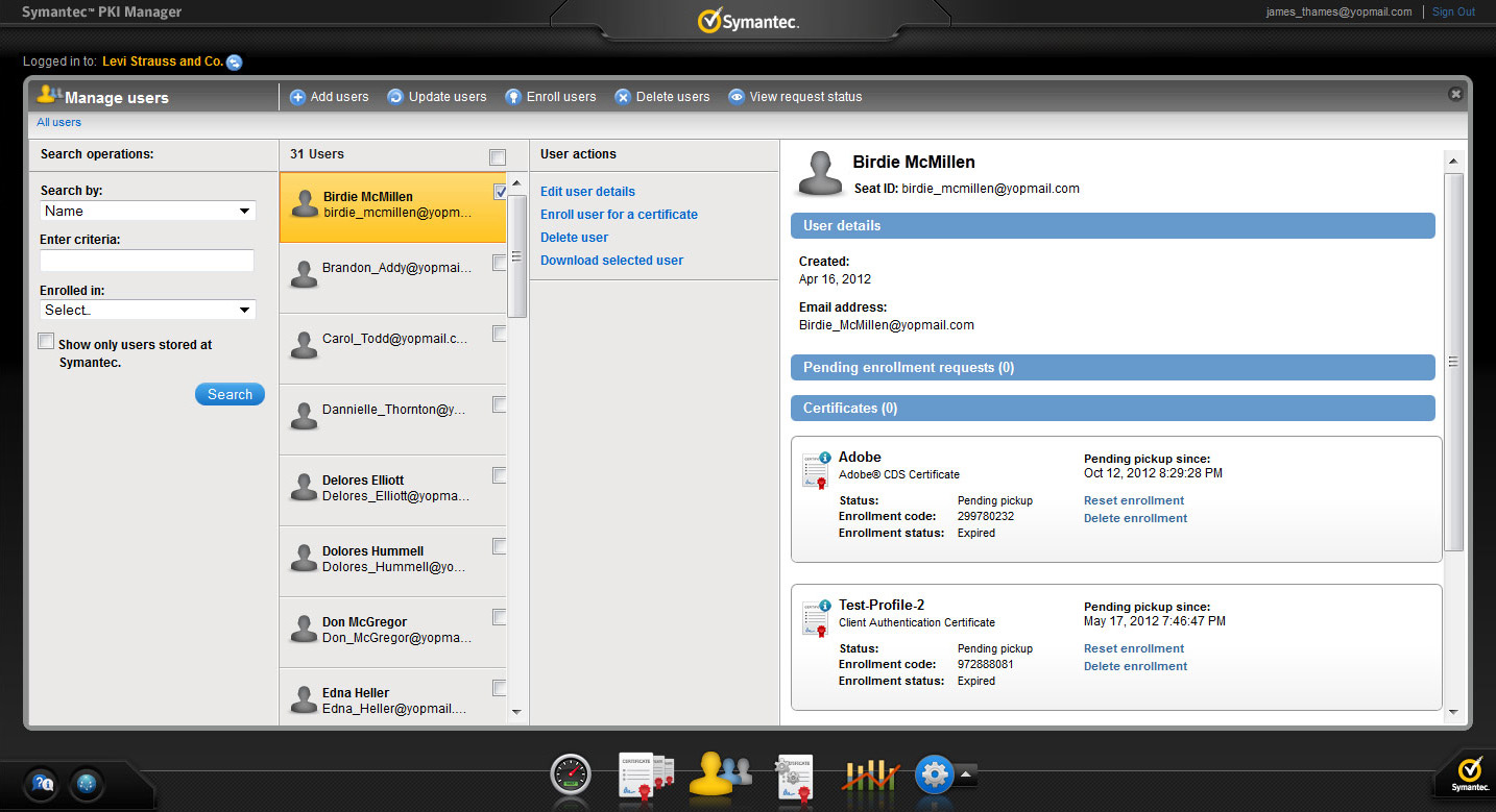
Manage Users UI in New Template
Examples of the Manage Users UI in the new template. A new panel for displaying search results increased the number of results displayed by default. Global actions were moved from the right panel to above the panels, putting them in better context and freeing up horizontal space for the new fourth details panel.

Template on a Wide Screen
On a wider screen, the rightmost panel would keep expanding while the first three panels stayed visible.

Template on Small Screen
At a set breakpoint, the search panel would slide to the left to give more room to the part of the UI where the user needed to focus on.
More Symantec Work
Symantec PKI Client
The design of a desktop client that lets end users manage their digital certificates.
Template Redesign
A look at the process of rearchitecting the entire application template to improve UX.
Symantec Managed PKI UX Process
The year long UX process my team undertook to learn about the technology and the users.