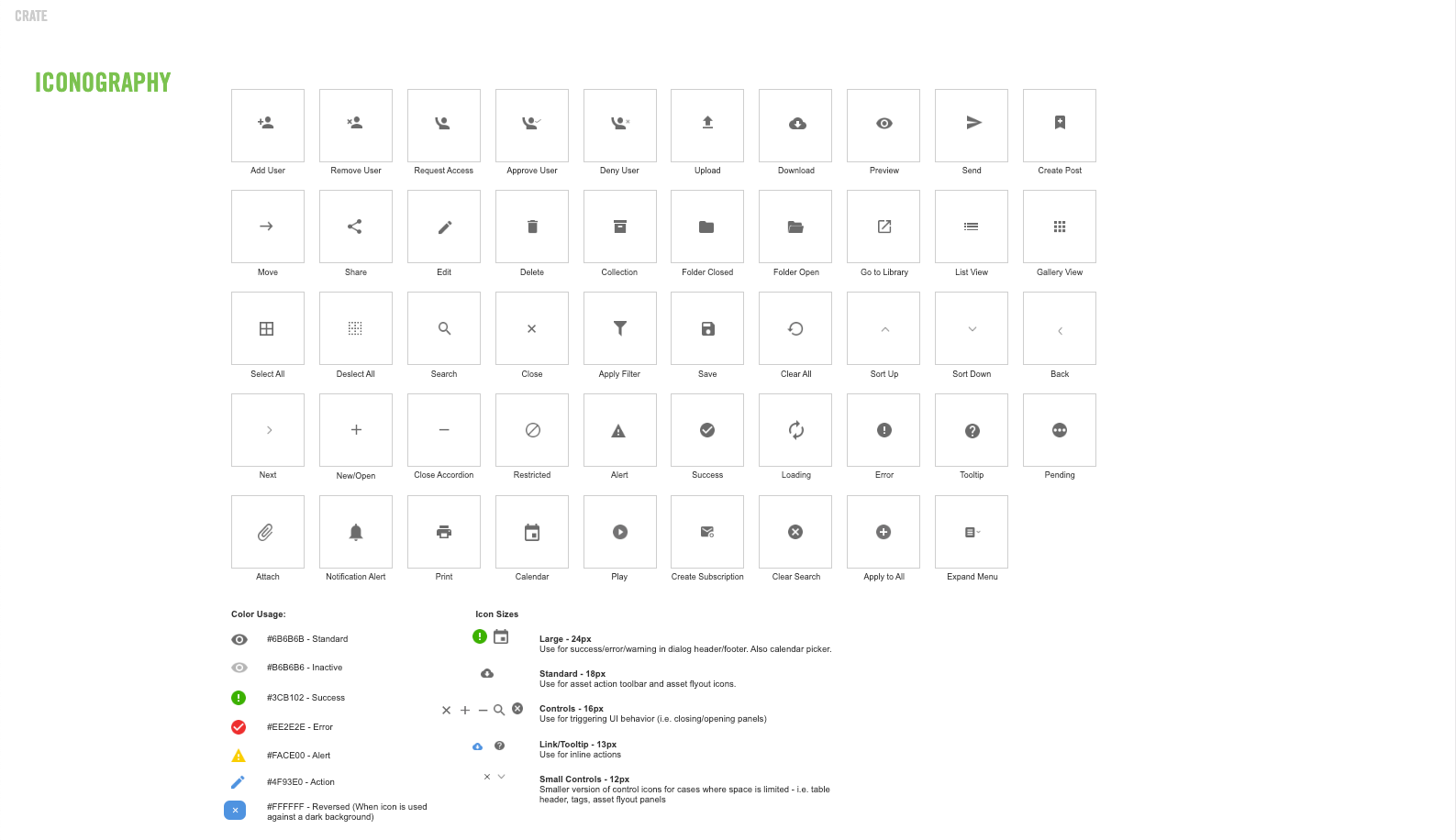
After starting on the Crate project one of my first tasks was to create a style guide based off the visual design direction I had established. Since we had decided to build a custom user interface on top of the Alfresco platform, this gave me a lot of freedom to design something that looked fresher, but also aligned with Nike's branding. The design philosophy, from the start, was to keep the UI as minimal as possible so that the assets were always the focus. Using the Nike typefaces, Trade Gothic Bold Condensed, Futura Extra Bold, and Helvetica, I selected the appropriate fonts for body and header copy. I then translated these in to HTML body and header values, since the application would be built out using HTML and CSS. I landed on using Google Material icons for all of the iconography because I found the variety, and design, to be just right for Crate. Google Material icons are also much easier to work with as a front end developer because you aren't having to deal with individual asset files.
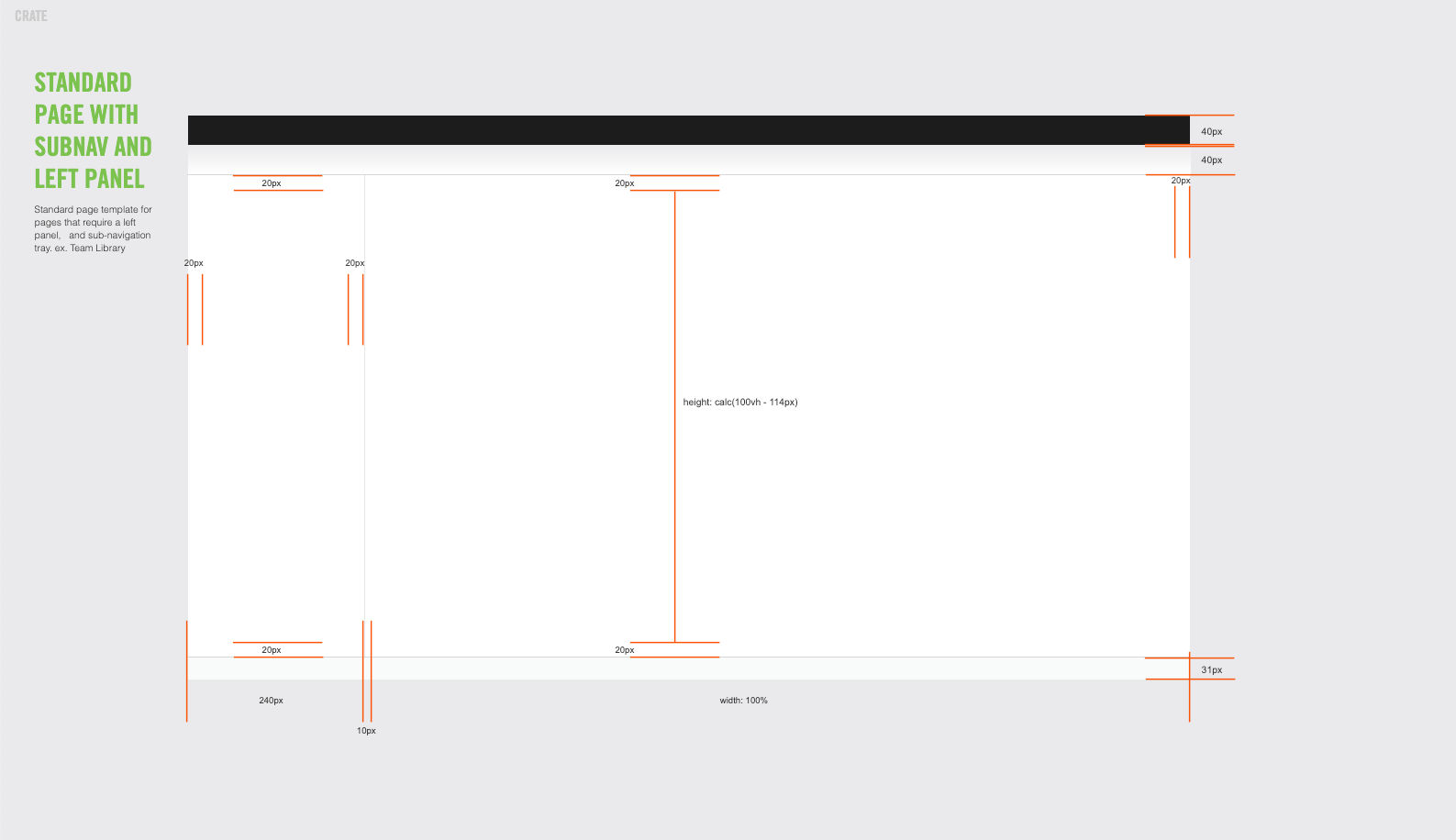
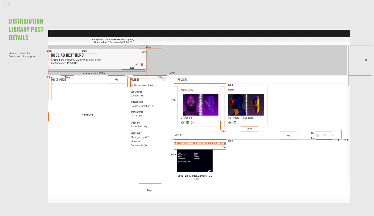
I decided to create the style guide in my UI design application of choice, Axure, because of the ability to create a library of reusable UI components, and for the ability to publish as HTML. Also, being able to create the page templates in Axure made it much easier to specify all of the dimensions of the UI.
Below are some examples from the Crate style guide.


